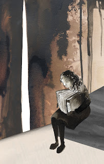
In the end I came to these five final images (in order) which I think worked best as a set. I have presented them next to the relevant pieces of text to give an idea of how they would look in the book. I am quite pleased with the images as far as my photoshopping skills go, i tweaked them quite a lot digitally which I don't usually do. However I think they could be better and I would have liked to have made more of them. I think the overall look of them is quite appropriate for the tone of the narrative. Although I was showing moments of compassion in the book, I kept the colour palette quite dark as it is quite a sombre book. Next time I am doing something much more upbeat....
Friday, 1 March 2013
development
After a crit with my lecturer I developed these images further by adding in drawn elements into the background. It was decided that one of the images (the best one) had more going on in it than the others and it needed to be balanced out somehow. Using ink I painted a window or some stairs, and then added them in on photoshop, changing their opacity so that they would only faintly come through. I wanted to give a suggestion of them.
I didn't think this worked however, it looked like they had just been plonked in there, making the images look disjointed.
ideas
I have decided to go down the inky route! I took some photos to take reference from to make ink drawings of the chracters. I really liked my inky patterns that I hade made and wanted to enconcorporate them somehow. By showing space in the images I hope to emphasise isolation which is also prominent in the book.
Layouts and The Standover Man
Thumbnail ideas for my chosen scenes. I have decided to focus on the theme of love and compassion and how it is shown against a background of war. Although the narrative is a sad one, there are moments of contentment and real affection between certain characters. I want to evoke this somehow without being completely literal. At the moment these don't have interesting enough angles, and I need to draw from reference!
I have also made my own version of The Standover Man. The character Max Vandenburg makes this book for Liesel's birthday using ripped out and painted pages from Hitler's book Mein Kampf. I wanted to make another book after the book making workshop last week. I painted the paper with white watered down acrylic paint which made the pages dry nice and crinkly, and then I painted the illustrations inside with black acrylic.
Friday, 22 February 2013
Monoprinting
I experimented with monoprinting a while ago, just collecting some interesting textures and what not!
Monday, 11 February 2013
Book making!
We had a book making workshop which was fun. I had never made a book before and I'm pretty pleased with it!
I've also been messing around with my ink drawings on Photoshop. I'm still pretty rusty on photoshop but I want to try and make some images in this sort of style for my project...
Life drawing
I've been going to some (very much needed) life drawing classes recently. These are the quick sketches I did for the short poses, I think they look better than the drawings i spent longer on!
Tuesday, 5 February 2013
Experimental
Colour plays quite a dominant role in this narrative and I actually came up with this when I was picking the dried paint off of my paint palette in the kitchen. It peeled off in thick layers of rich colour, and it brought to mind the references to Death collecting the souls of the dead: "So many humans. So many colours."
I stuck them on the page and drew the hands of Death in black ink, looking almost as if they are letting the colours run through the fingers. I wanted the type to be an extension of the colours, as if they are running down to the ground.
Acrylic paint and sepia stick.
Charcoal drawing with added textured from my monoprints (Photoshop)
Monday, 4 February 2013
Watercolours
I did this drawing in watercolour pencil a couple of weeks ago, it actually looks better on screen than i thought it would. I'm pretty much experimenting with everything in my art box at the moment!
Thursday, 31 January 2013
Jim Kay
I have been doing a little research online into illustrated 'young adult' fiction books and I came across these amazing illustrations by Jim Kay. They are for the book A Monster Calls, by Patrick Ness. I had never heard of the book but these dark and somewhat sinister images caught my eye and it really makes me want to read it. I'm going to have to find this book at the weekend. The description says it is a story of a young boy struggling with nightmares and the fear of losing a loved one. These themes of nightmares and fear are also apparant in The Book Thief.
Liking the double page spread. Might have to experiment with that.
Subscribe to:
Comments (Atom)


